Almost every graphic up until this post and probably some subsequent ones, are open to misinterpretation and yet can also provide useful information and event overview.
The graphic below shows failed log in attempts each hour over the 320 day logging period from the previous dovecot logging articles. The line graph was produced using the defaults within the python seaborn: statistical data visualization package.

It is an example of poor practice in data visualisation. It appears that China based ip addresses attacked around 20:00 (8 pm). Below is a corrected graphic where the hour hits for the UK have been added.

Compared with the British attack and rescaled, the spread of China over the hours each day, look a lot less dramatic. The largest “Chinese”1 peak at 20:00 was a 20% variance, however on the first graphic it appears more dramatic when the x-axis does not start from zero.
For the UK, on the 25th May 2023 between 08:12 and 08:51, 2 computers attempted 206 logins, the average hourly login was 28 failed attempts, in total over the 320 day period 226 failed attempts at 8 am were made, giving a 700% increase and the spike illustrated above.
And this leads to the “possibly open to misinterpretation” comments above. To produce the graphics the data is grouped, this is to highlight changes in state. So in these “hourly” graphics it would be a mistake to assume that a point on the line between 8 and 9 was the amount of attacks that happened at half past eight in the morning. This would be massively incorrect. The point at 8am is for all the hits that occurred from 8 to 9, it would be less liable to be misinterpreted if the graph was a histogram.
So a quick comparison:
Iran appears enthusiastic at 2 am and 11 am compared to China and the USA

However as a bar plot the data is almost unintelligible.

Likewise with the all the data analysis from the embedded tableau line graphs.
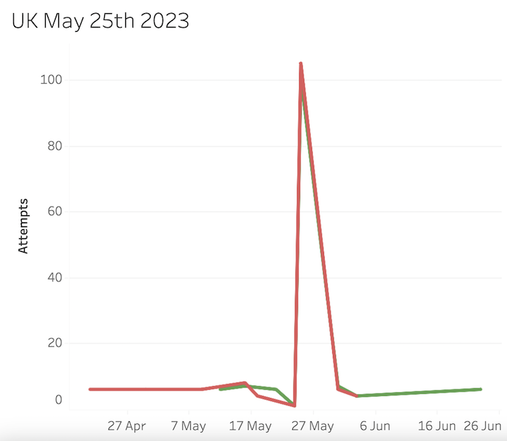
It could be assumed that around the 25th May there was a massive increase that dropped down in a linear fashion a week later. This is entirely incorrect, there were in fact no attempts at all until 31st May so the line is going from point to point rather than dropping to 0 for the days when no logins were attempted.
It should be noted that the graphics are not provided for drama or misinterpretation, they are provided to quickly view that an abnormal event has taken place.
Viewing a spreadsheet the data may not be obvious, in the above example, if the data was in date order then one might pick up a jump from 6 or 7 hits to 200 but only if the table was showing the UK, as it happened an Iranian botnet was present at the same time so overall high loads were present. If the data was sorted by number of hits over the year per day as below. 200 hits from two UK addresses would easily be overlooked as ordered by hits per day it is the 21st day on the list and yet the event so easily visualised formed the basis of an investigation into a potentially serious configuration error.
| id | day | hits |
|---|---|---|
| 1 | 2023-11-12 | 1307 |
| 2 | 2023-11-13 | 1070 |
| 3 | 2023-11-11 | 468 |
| 4 | 2023-05-09 | 396 |
| 5 | 2023-04-14 | 390 |
| 6 | 2023-04-21 | 358 |
| 7 | 2023-04-22 | 356 |
| 8 | 2023-04-25 | 342 |
| 9 | 2023-07-19 | 329 |
| 10 | 2023-03-02 | 320 |
| 11 | 2023-02-09 | 313 |
| 12 | 2023-03-16 | 307 |
| 13 | 2023-03-23 | 306 |
| 14 | 2023-03-08 | 304 |
| 15 | 2023-11-21 | 292 |
| 16 | 2023-07-17 | 290 |
| 17 | 2023-04-13 | 289 |
| 18 | 2023-11-23 | 279 |
| 19 | 2023-03-19 | 276 |
| 20 | 2023-03-09 | 275 |
| 21 | 2023-05-25 | 273 |
- “Chinese” only as attacks from computers that appear to have ip addresses based in China. ↩︎